Bar Charts with Labels
This is an example to draw a informative bar chart using “geom_label” from “ggplot2”.
Let’s start with generating some sample data.
# we will use the Motor Trend Car Road Tests datasets from R base (only the first 15 models for better illustration)
# run ?mtcars for details of the datasets
df = mtcars[1:20,]

# showing the first 7 rows of the data frame for illustration
head(x = df, n = 7)
##                    mpg cyl disp  hp drat    wt  qsec vs am gear carb
## Mazda RX4         21.0   6  160 110 3.90 2.620 16.46  0  1    4    4
## Mazda RX4 Wag     21.0   6  160 110 3.90 2.875 17.02  0  1    4    4
## Datsun 710        22.8   4  108  93 3.85 2.320 18.61  1  1    4    1
## Hornet 4 Drive    21.4   6  258 110 3.08 3.215 19.44  1  0    3    1
## Hornet Sportabout 18.7   8  360 175 3.15 3.440 17.02  0  0    3    2
## Valiant           18.1   6  225 105 2.76 3.460 20.22  1  0    3    1
## Duster 360        14.3   8  360 245 3.21 3.570 15.84  0  0    3    4
Suppose we wants to show the weight in tons (wt) of the cars, we start with a basic bar chart.
library(ggplot2)  # for plotting
library(cowplot)  # for publication friendly ggplot themes

# setting up the base plot
g = ggplot(data = df, mapping = aes(x = rownames(df), y = wt)) + geom_bar(stat = "identity") + theme_cowplot() + labs(x = "Models", y = "Weight (tons)")

g
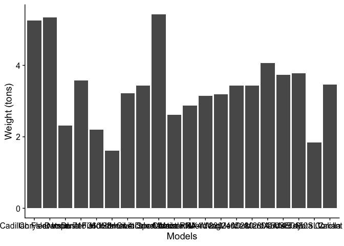
Oh, the names of the models are all overlapped…Let’s fix it by rotating them by 45º.
# fixing the overlapped the labels of the x-axis
g1 = g + theme(axis.text.x = element_text(angle = 45, hjust = 1))
g1
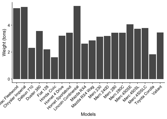
Looks not bad.
Now, let’s suppose that we somehow want to know the total weight of
automatic transmission cars vs manual transmission cars (i.e., based on
the am column), we can visualize it by stacking up the bars.
# converting the entries in the "am" column into factor-valued (Note: 0 = autmatic, 1 = manual, in the original data)
df$am = factor(df$am, labels = c("automatic", "manual"))

# fixing the overlapped the labels of the x-axis
g2 = ggplot(data = df, mapping = aes(x = am, y = wt)) + geom_bar(stat = "identity", position = "stack", color = "black") + theme_cowplot() + labs(x = "Transmission", y = "Weight (tons)")
g2

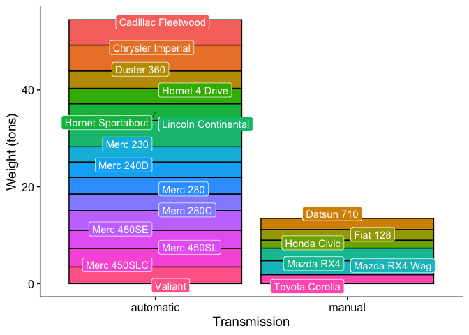
Wow, we now know that the cars with automatic transmission are heavier than the manual ones. We can also show how much weight each car has contributed.
# adding colors to the bar
g3 = g2 + geom_bar(mapping = aes(fill = row.names(df)), stat = "identity", position = "stack", color = "black") + labs(fill = "Models")
g3
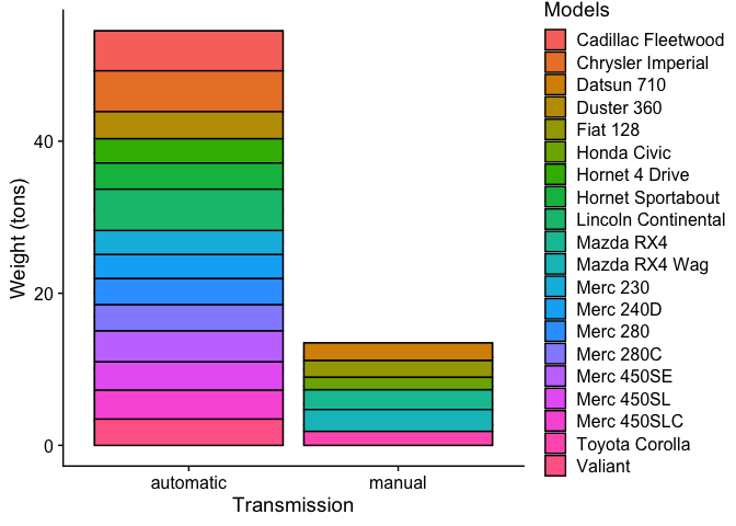
Not bad. But, what cross referencing between the bar segments and the
legend makes people’s eyes sore. Can it be easier? Yes, and the answer
is geom_label.
# adding labels on the bar chart
g4 = g3 + geom_label(mapping = aes(label = row.names(df)), position = position_stack(vjust = 0.5))
g4
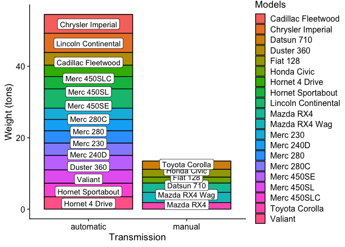
Wait, there are two problems. First, the labels are mismatch!!!
Second, labels are overlapped!!! For the first problem, it is because
geom_label and geom_bar are not sharing the same mapping aesthetics,
i.e., fill is only defined in geom_bar only. Therefore, the data are
not “grouped” properly for both objects. The fix is to set fill as a
global variable. For the second problem, we seek help from the package
ggrepel. Let’s check out the codes:
# adding a new grouping variable to the plot
g5 = ggplot(data = df, mapping = aes(x = am, y = wt, fill = row.names(df))) + theme_cowplot() + labs(x = "Transmission", y = "Weight (tons)", fill = "Models")

# adding the bar chart
g5 = g5 + geom_bar(stat = "identity", position = "stack", color = "black")

# adding new labels
library(ggrepel) # for the function (geom_label_repel)
g5 = g5 + geom_label_repel(mapping = aes(label = row.names(df)), position = position_stack(vjust = 0.5), color = "white", segment.alpha = 0.5, segment.color = "black")

g5
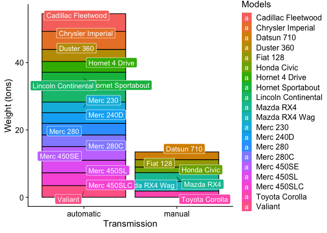
After ensuring the labels are correctly matched, we can even omit the legend which is kinda redundant.
# turning off the guides
g6 = g5 + scale_fill_discrete(guide = guide_none())

g6
Ka Ming FUNG
Data Scientist
Data Scientist who’s interested in the interactions between food security, air pollution, environmental health, and climate change